NAZENDE FISH RESTAURANTBRAND IDENTITY · ILLUSTRATION · INTERIOR CONCEPT
01 / AN ISTANBUL TABLEAn interior concept I developed with AI
01 / DESIGN AND PRODUCTIONHow I built this world
From an idea to an entire world.
It all began with a single question: can the memory of Istanbul fit on one table? Nazende is my answer — an imagined brand universe I built from end to end, with its story, identity, interior and menu.
01 / REFERENCES AND CONCEPT
Designing the world
I described the idea, the concept, the reference images and every step of the brand to AI one by one, turning it into an assistant working for me. Fed with my own illustrations, that assistant became the greatest help in building everything from the brand figures to the porcelain collection and the Istanbul-view interior.
02 / AI-ASSISTED PRODUCTION
Making the imagined visible
I generated the interior, the table, the product scenes and the plate illustrations with AI. From everything produced, I kept only what belonged to the same visual world, and brought it all together in one atmosphere — the late-afternoon light of Nazende.
03 / DESIGN AND REFINEMENT
Completing the details
No frame left the AI and entered the page as it was. I refined the compositions in Photoshop, carried the linework into vector in Illustrator, and built the menu’s page layout in InDesign. The details were completed at this table.
How can a fish restaurant’s identity tell its story before a guest even takes a seat?
I imagined Nazende on the Üsküdar shore, directly across from the Maiden’s Tower: a fish restaurant positioned in the upper-mid segment, its windows opening onto the city’s oldest tale. It draws its inspiration from the Ottoman tile tradition, Istanbul’s maritime culture and the legend of the Maiden’s Tower.
I reinterpreted this deep-rooted heritage through the principles of modern branding. From the interior design to the logo and corporate identity, I carried one story without interruption; I shaped the illustrations with AI and reflected this language onto every detail of the space — the plate sets, the table arrangements, the pages of the menu.
Nazende has no physical restaurant. I generated the interior, table and product imagery with AI, guided by my own reference illustrations. These images make the experience I imagined visible: a world that hosts the city’s old tale at today’s table.
THE CHALLENGE
Translate cultural richness into an elegant, coherent identity.
THE APPROACH
Bring the city’s associations into distinctive figures and tangible brand touchpoints.
THE OUTCOME
A brand world extending from the first encounter to the menu’s final page.
03 / VISUAL LANGUAGEParts that complete one another
A signature from the sea.
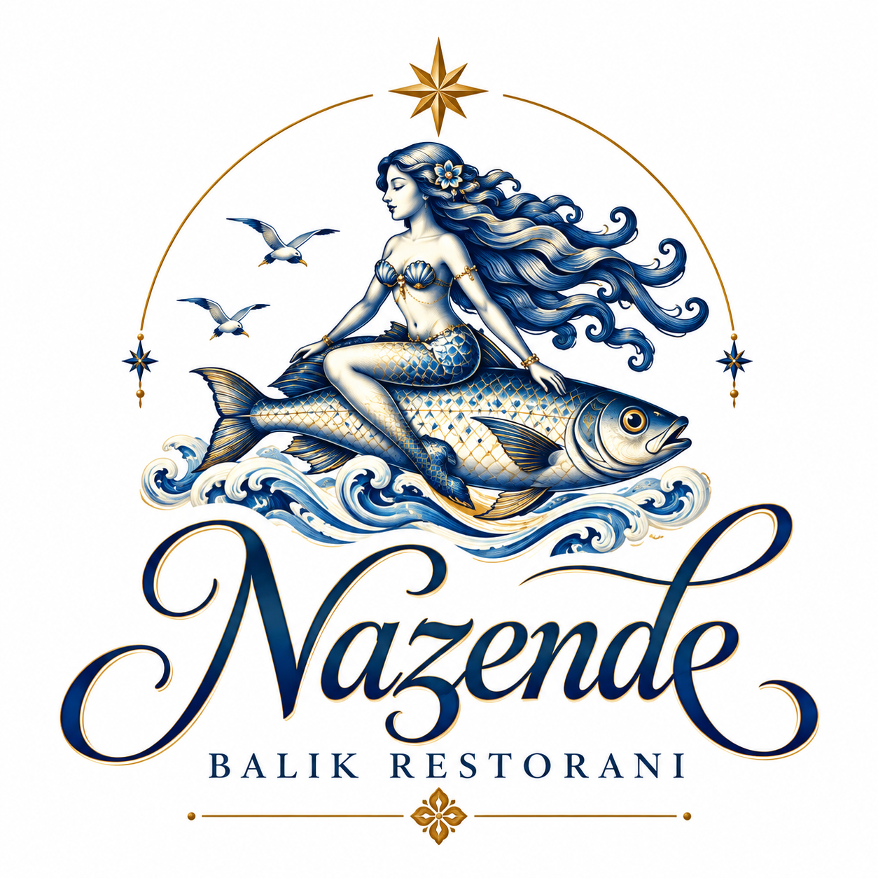
A mythical mermaid and fish, a compass star and waves. The primary logo carries the layered story; simpler monograms adapt it to
smaller touchpoints.
EXPLORE THE LOGO SYSTEMSelect a variant ↓
The complete brand signature
The mermaid-and-fish emblem joins the Nazende name and “Balık Restoranı” descriptor. Together, they form the primary brand
logo.
PRIMARY COLOURS
Bosphorus navy#102d48
Gold#b08b4d
Porcelain#f8f4e9
ACCENT TONES
Deep navy#011f3d
Light gold#d1a25e
THREE VOICES, ONE IDENTITY
Character in headlines. Elegance in storytelling. Clarity in information.
NAZENDE
Cinzel
Short headlines and strong statements
A story around the table.
Cormorant Garamond
Editorial storytelling and elegant emphasis
A memorable encounter.
Manrope
Interface, descriptions and supporting information
Logo animations
01 / PRIMARY LOGO ANIMATION
A figure born from the wave.
0:00 / 0:00
02 / LOGOTYPE ANIMATION
From the first stroke to the final curve.
0:00 / 0:10
03 / MONOGRAM ANIMATION
The first light of the compass star.
0:00 / 0:00
04 / FROM TILE TO TABLEThe journey of a motif
Beyond decoration.
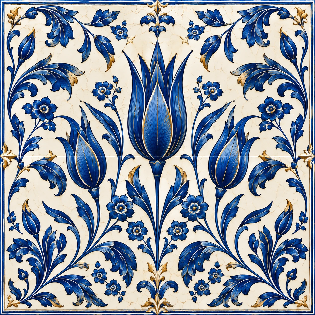
The ceramic motifs developed with AI were interpreted in line with the concept and created anew. Ceramic and marine figures refined through reference drawings were worked into the plates, the borders within the space, the textiles and the objects that complete the interior. The motif language inherited from Ottoman tile art was reinterpreted as a cultural heritage and translated into the language of today’s table. The transformed illustration thus moved beyond decoration and became part of the space’s visual language.
From a ceramic garden to the table
The tulip, the leading motif of Ottoman tile art, is interpreted as the carrier of the brand’s elegance. Its symmetrical rhythm is designed for napkins, table linens and the welcome area. Quiet white surfaces give the rich motif room to breathe.
The meanings I give to these motifs are my own interpretations for this project.
01 / 03
01 / Where motif meets material↗02 / Sea stories on porcelain↗
05 / THE MENU EXPERIENCEA journey through the pages
The story opens. The table is set.
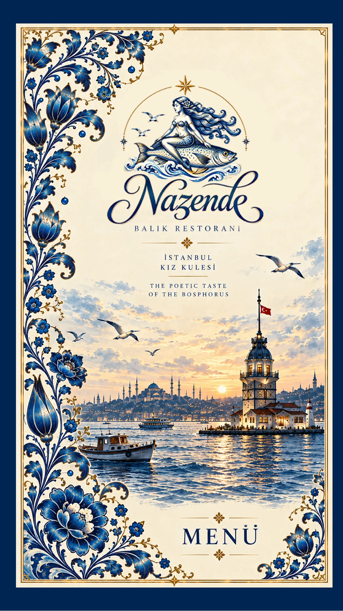
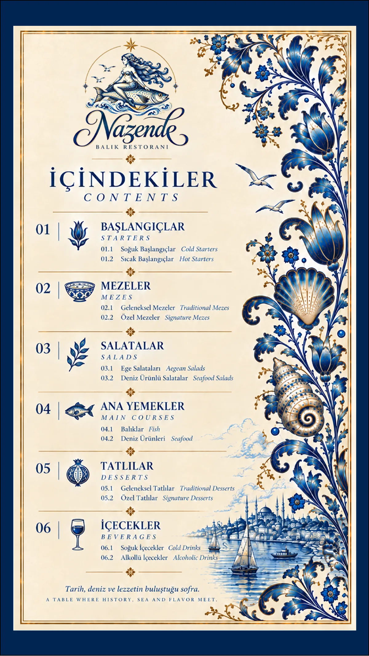
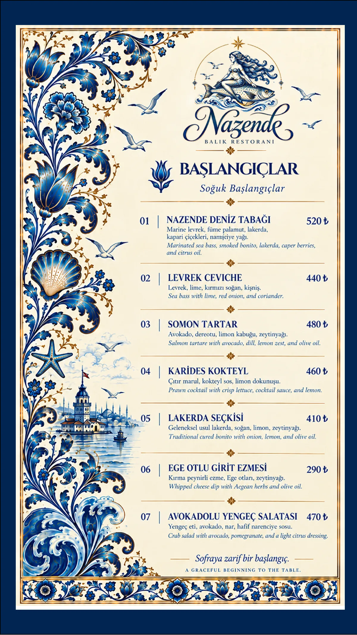
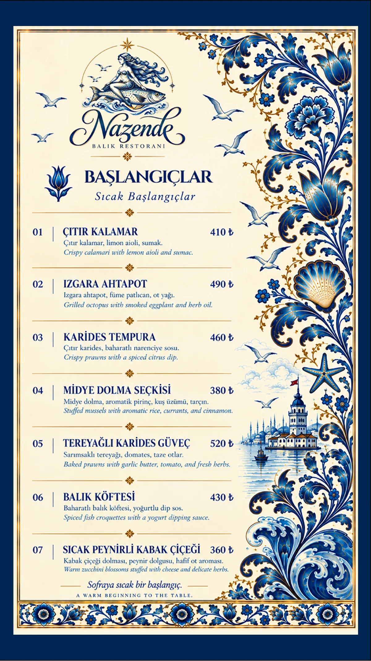
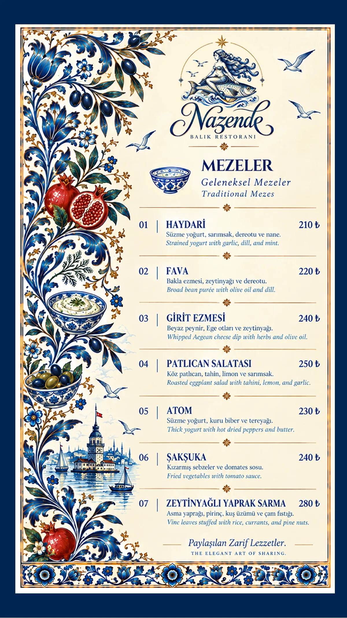
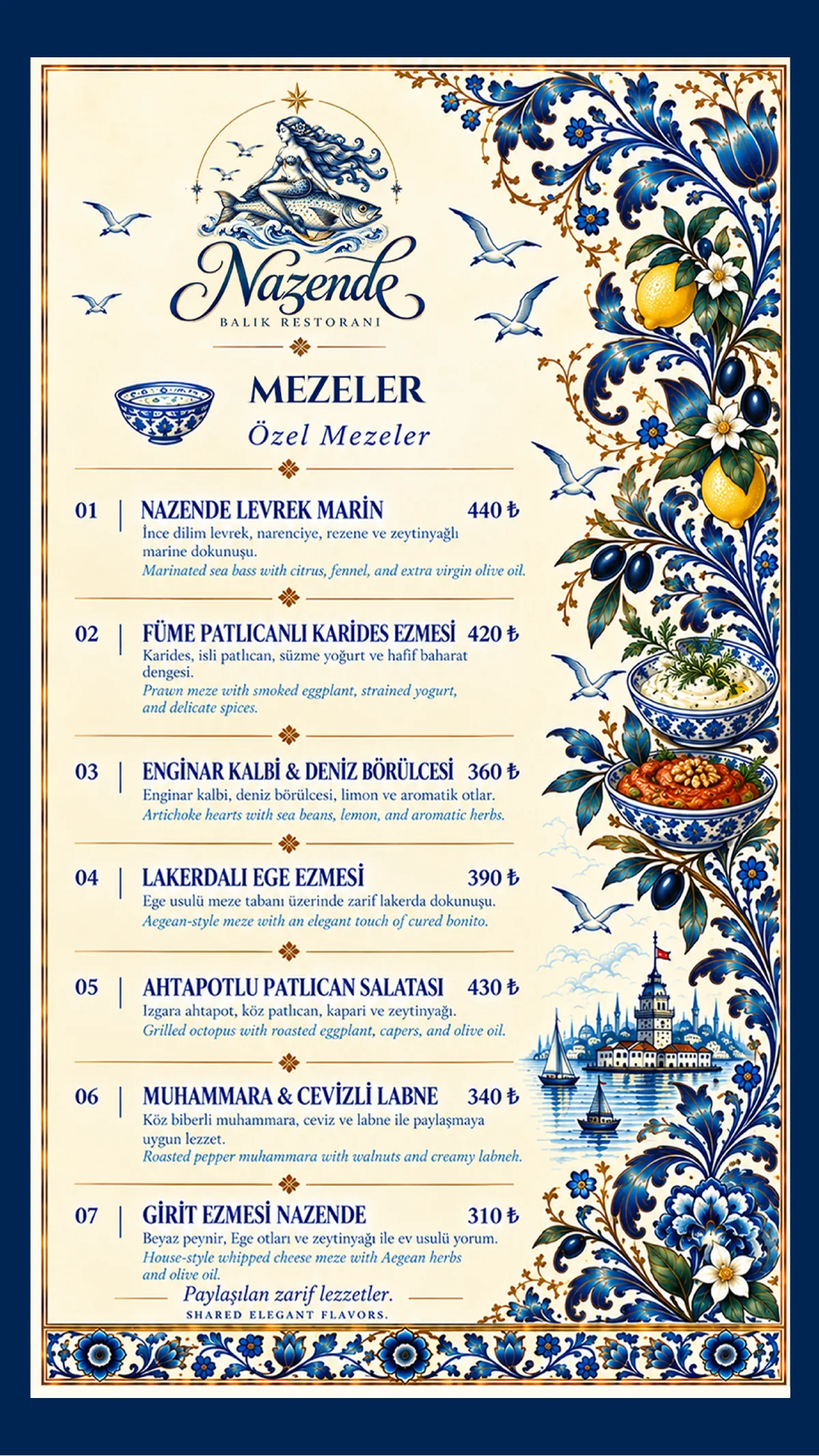
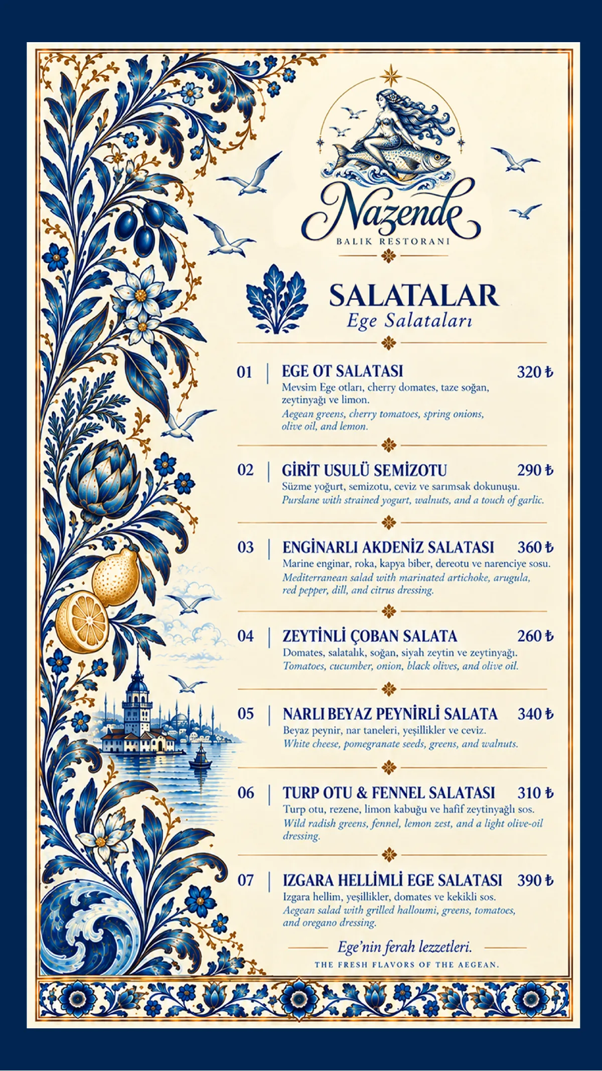
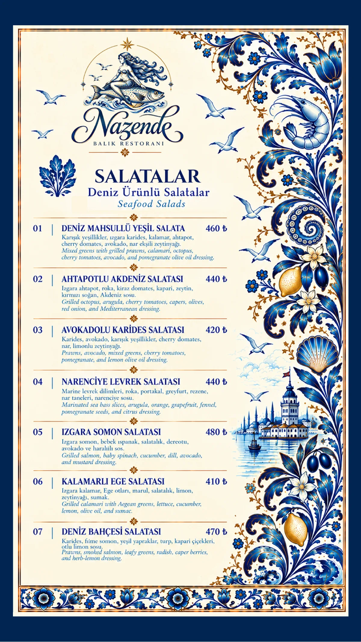
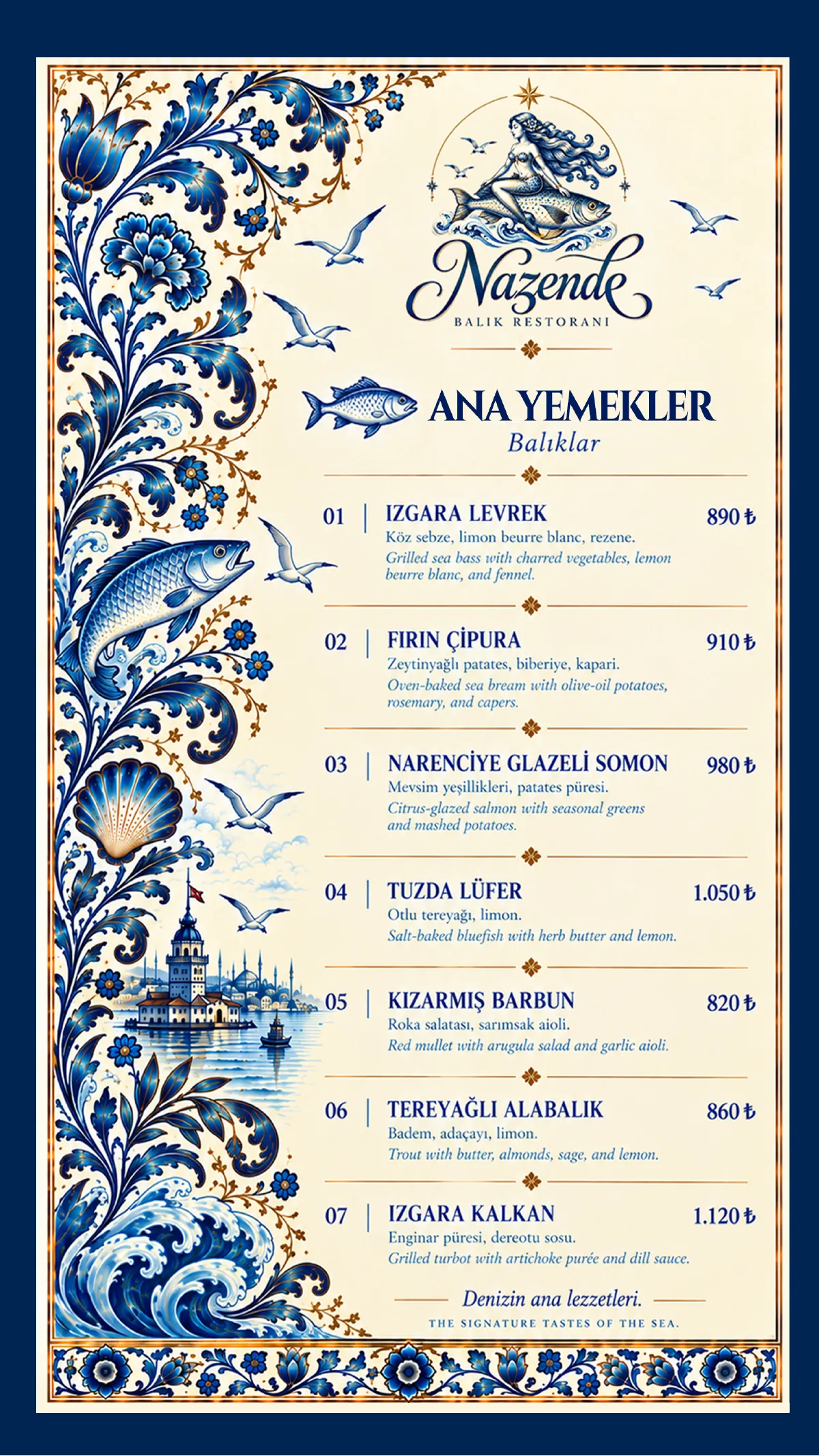
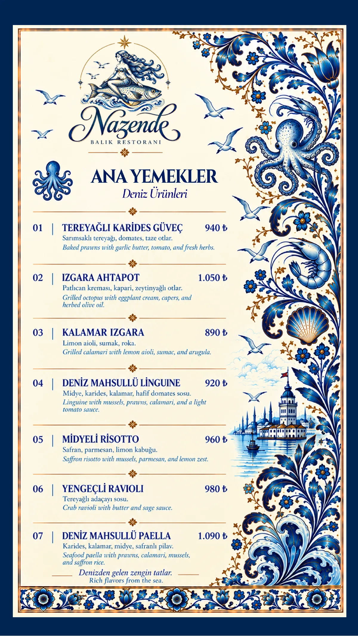
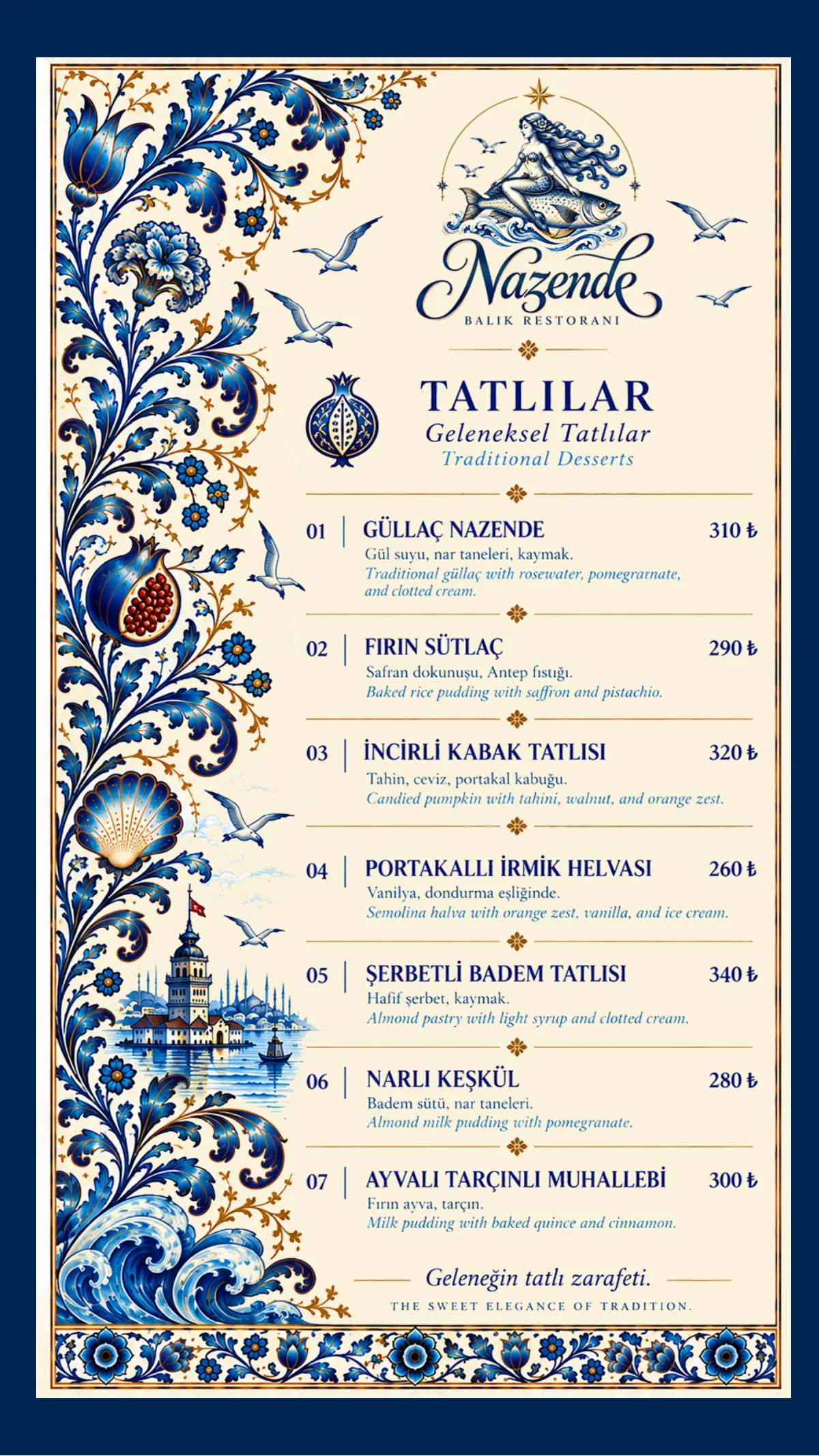
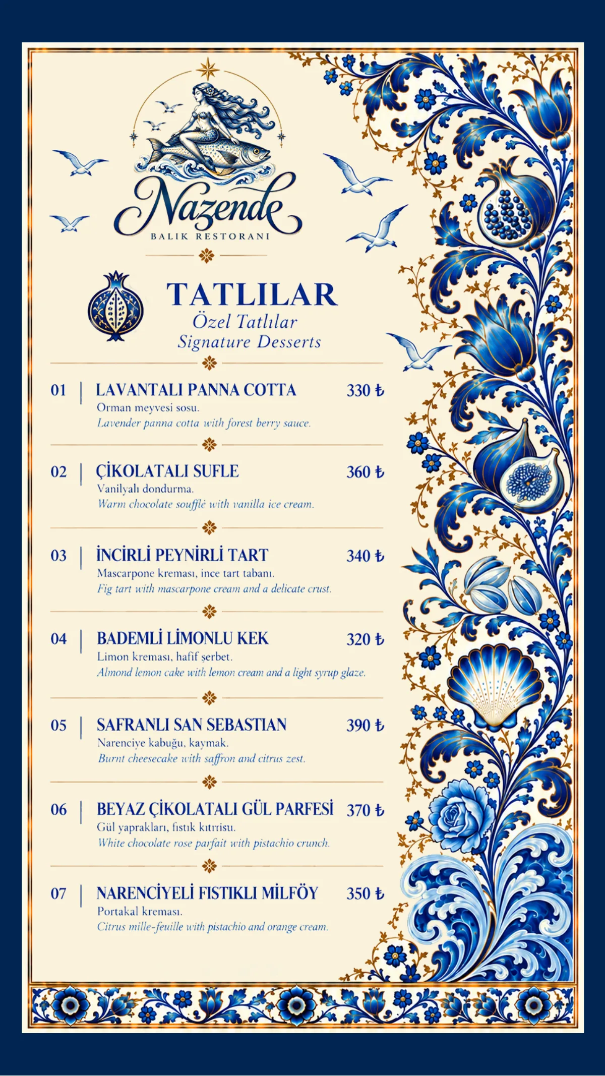
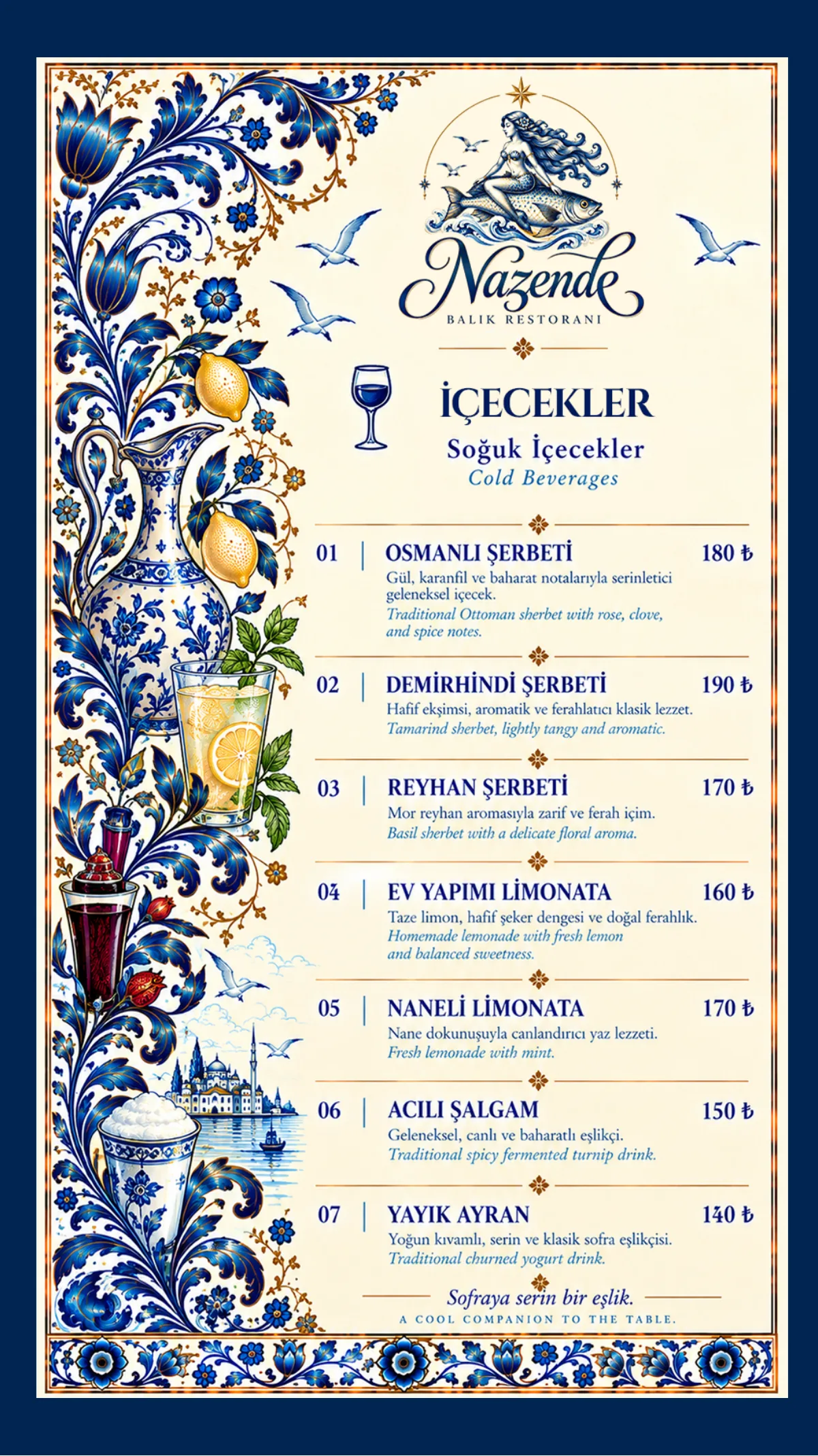
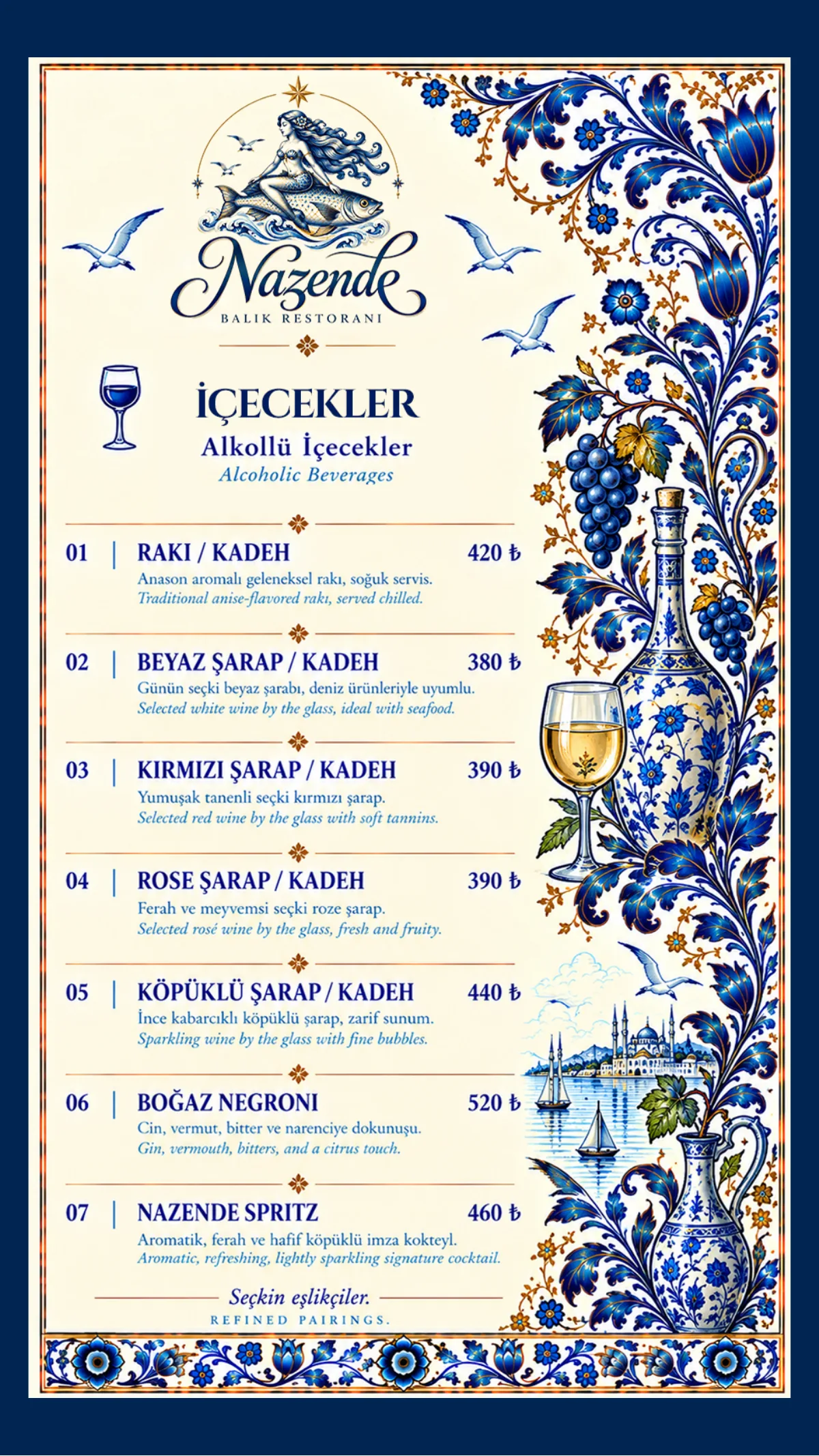
Ceramic borders, section icons and a bilingual layout bring different flavours into one system. The visual narrative changes with each category.
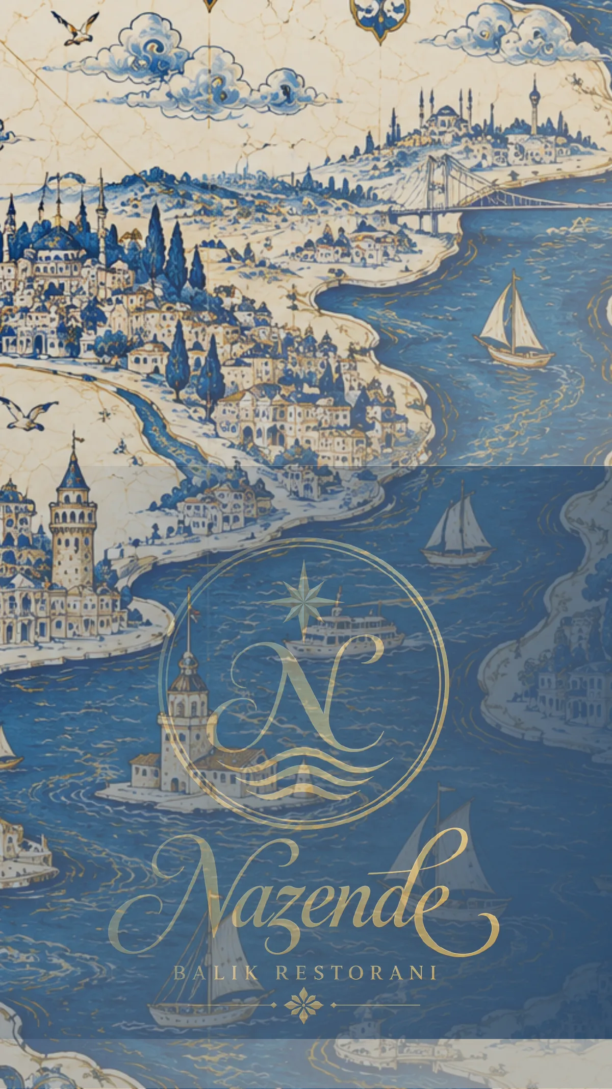
Front cover A ceramic frame, the brand signature and Istanbul’s silhouette.
All 16 menu pages retain their original design. Drag a corner, click a page or use the arrows to turn. Narrow screens show one
page at a time.
06 / SOCIAL MEDIAA story that continues in the feed
In the feed, the same tale.
I built the Instagram feed on three visual languages: arched cream pages, navy night frames and tile grids. Arranged in a checkerboard on the profile, the light and dark posts balance each other; each post reads on its own, while the nine together become a single brand wall.
01 / ARCHCream ground and arched frames; quiet moments of the space and the table.
02 / NIGHTNavy and gold; the name, the space and the catch of the day.
03 / TILETile grids; stories of motif, legend and porcelain.
Nine posts on the profile01Nine posts, one wall02
ANIMATED POSTS
Each post comes alive in a quiet eight-second loop. The lines of text appear one after another and the gold rules draw themselves. The mermaid comes from the primary logo animation; the map gliding toward the Maiden’s Tower is a clip I generated with AI.
No. 09PorcelainNo. 08The spaceNo. 07Two shoresNo. 06Catch of the dayNo. 05Late afternoonNo. 04The tableNo. 03LegendNo. 02The nameNo. 01The brand
In profile order: No. 09 → No. 01
The Maiden’s Tower in four frames03A quiet invitation in the city04
07 / LOOK CLOSERThe many faces of an identity
From the whole to the detail.
Identity becomes objects01Freshness from the sea02One table, one brand world03An Istanbul evening04The city’s visual memory05From menu to table06
6 images shown.
08 / THE LANGUAGE OF SPACEAn approach framed by Istanbul
A view becomes an encounter.
I worked this space, born of my imagination, until it carried the feeling of a real photo shoot. For this I used GPT Astra and Photoshop — and reached the result faster than I expected. As wide, airy windows open to the sea, linen napkins on the tables, greenery in the shade of the arches and ceramic surfaces softening in the late-afternoon light lift the spirit. The plate illustrations, the ceramic patterns and the atmosphere of the space meet within the same dream; the tradition of the past mingles with life through the rules and rhythm of the modern world.
01 / LIGHT
The warmth of evening
Candlelight and sunset soften the depth of navy blue.
02 / MATERIAL
An identity you can imagine touching
Ceramic, fabric and paper carry one visual language through different textures.
03 / FOCUS
Freshness from the sea
The seafood and table compositions I generated with AI complete the dining experience I imagined.