 Ayverdi Eczanesi
Brand identity & social media · 2026
In the light of science, Ethical Pharmacy.
For Ayverdi Eczanesi, a pharmacy in Salihli, Manisa, I built a system that runs from the logo all the way to the content voice: an identity that inspires trust, never overstates, and speaks in the pharmacist's own voice.
Explore the carousels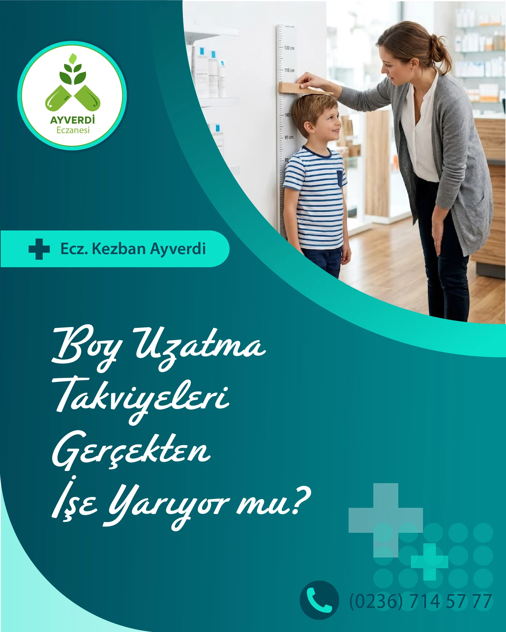
Ayverdi Eczanesi's principle is clear: pharmacy practised in the light of science, putting public health and professional ethics first. My job was to build the language that would carry this principle onto the screen.
In this project, "Ethical Pharmacy" is not a slogan but the yardstick behind every design decision. I derived both the written and the visual language from this principle: a voice that makes no promises, never exaggerates, and guides patients back to their doctor and pharmacist.
To bring out warmth and sincerity, I chose a handwritten typeface for the headlines; every card speaks as if in conversation with the person reading it. The sense of openness that comes with science, honesty and an ethical stance I expressed through these particular shades of blue and green: deep teal carries trust, while sprout green and mint carry cleanliness and freshness.
The content system works on the same principle. Every post opens with a question, answers it within an evidence-based frame and, at the point of decision, recommends consulting a professional. Phrases like "there is no miracle pill", "genetic potential" and "the right ingredient" restate on every card that the brand is built on trust.
- 01Logo & colour worldA sprout combined with capsules; a teal and green palette.
- 02Template systemCover + content pages, with a recurring grid and motifs.
- 03Series12 posts and 8 videos every month; topic-based carousels.
- 04Mini motionSmall animations for stories and reels.
Sprout and capsule.
I kept the logo simple enough to read at a glance and sharp enough to recognise even at profile-picture size. The green of the sprout brings an organic warmth, while the teal ring carries the openness that comes with science and honesty. The whole palette was built between these two feelings: trust and freshness.
- #014757Deep teal
- #018a90Teal
- #09e1caMint
- #66f28eSprout green
- #80b533Leaf
- #01252bInk
Typography in use
So Why Should We Take Supplements?
Genetics determine 70-80% of your height. The remaining 20-30% is environmental.
Headlines Redondo Ave, a handwritten typeface; I chose it to bring out warmth and sincerity. Body The Mundial family, for running text and explanations; it keeps information simple and readable.
The sample is taken from the third page of the "Height growth supplements" carousel: Redondo Ave in the headline, Mundial in the explanation. This page uses close web equivalents; the posts themselves use the original fonts.
- CrossThe pharmacy sign, at different scales and in semi-transparent layers.
- Dot gridA texture that sets a rhythm in the corners without making the page feel "crowded".
- Glass panelRounded, semi-transparent surfaces for blocks of text.
- CurveA large arc that splits the background in two, separating image from text.
Kurtuluş Mah. Gökçe Pınar Cd. No:158/B · Salihli
A layout that reads as a grid.
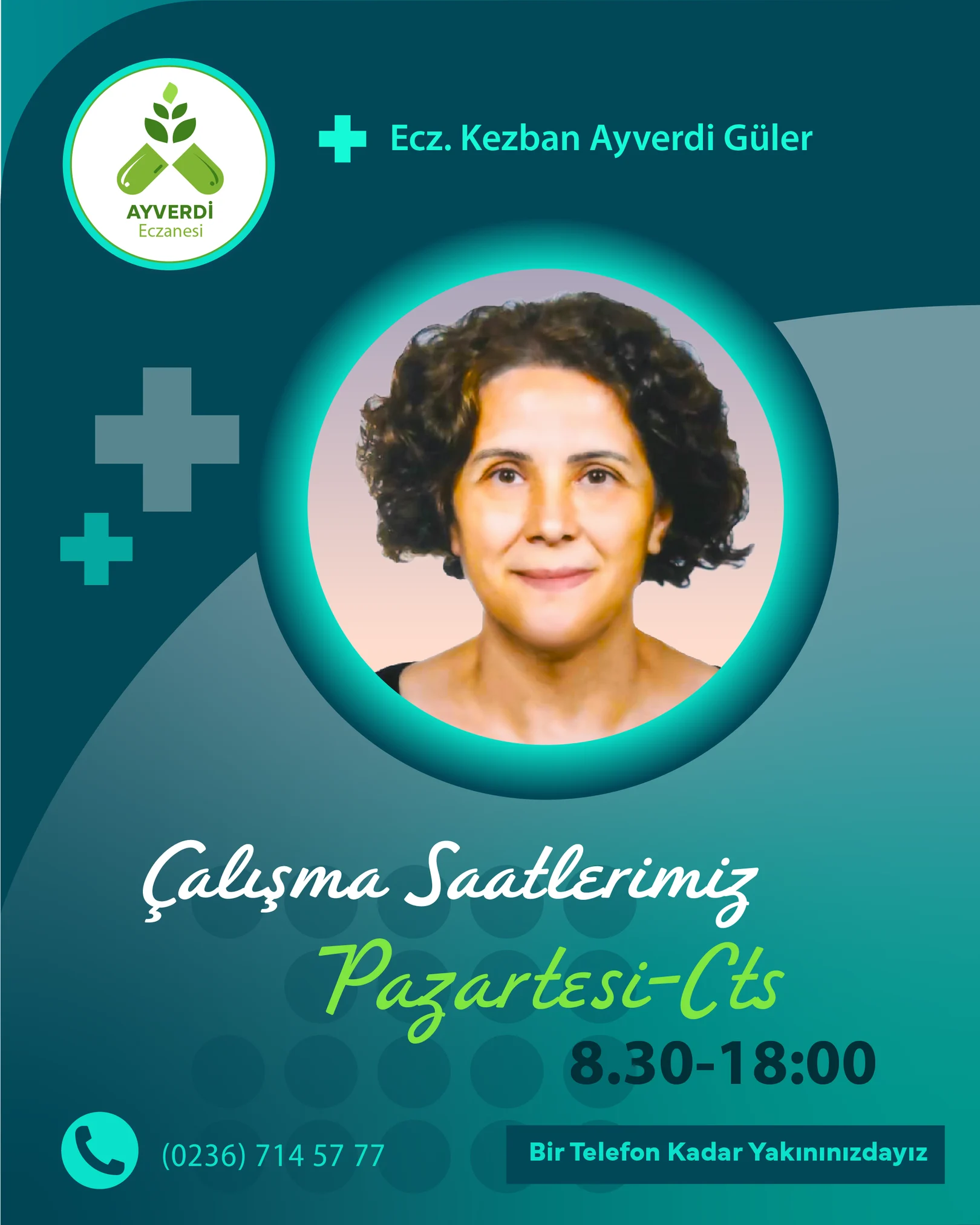
On Instagram, the first post shared lands in the bottom-right corner; the ones that follow line up in threes, moving left and upward. That is why I designed the 12 posts not one by one but in the order they would fall into place: in every row, dark and light backgrounds, and curves that open from left to right or sweep down from right to left, balance one another.
When the profile first opens, the eye scans all four rows at once. The logo is the same size on every card, the handwritten headline the same tone on every card; the only thing that changes is where the photo sits. This way the profile reads as a surface that is orderly without being monotonous.
The numbers show the posting order: 01 was shared first, at the bottom right. Each new post shifts the grid by one step.
On a small screen, great clarity.
Every page was tested on a phone first: headlines never run past three lines, the logo is always in the same corner, the phone number always on the same line. While scrolling, the eye never has to search.
Ethical Pharmacy
ayverdieczanesi