Interface design
A site redesigned from hero to footer: about us, coffee and dessert menus, promotions and a newsletter sign-up.
Go to the interfaceUAL Design / A case study for cafes
A redesigned website for Cafe Soho Co., a social media kit and a single color palette that ties every surface of the brand together.
Explore the project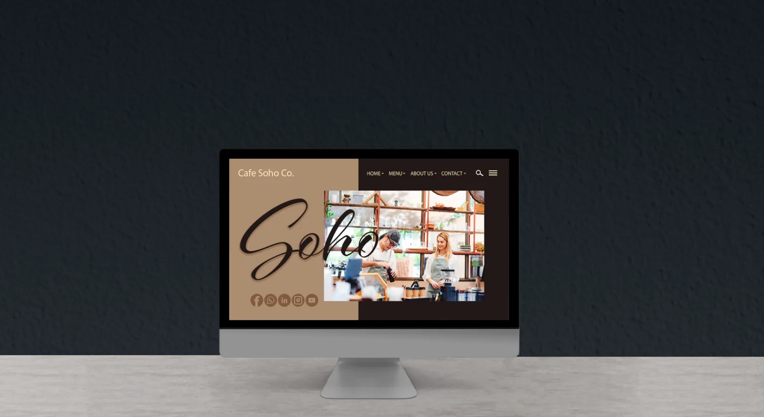
Cafe Soho Co. is a charming cafe in the heart of London, known for its welcoming atmosphere.
They take pride in being a haven of quality. Every cup of coffee and every bite is carefully prepared to create delightful moments for their guests.
Wanting to strengthen their online presence and build a more meaningful connection with their followers, Cafe Soho Co. reached out to me to draw on my experience in interface design and social media. I offered them a three-part package.
A site redesigned from hero to footer: about us, coffee and dessert menus, promotions and a newsletter sign-up.
Go to the interfaceA consistent Instagram feed built from product cards, weekly promotions and atmosphere posts.
Go to the kitFour colors and three typefaces that make the site and the posts part of the same cafe.
Go to the paletteI built the palette from the layers of a cup: four tones from the foam down to the roasted bean. The two light colors carry the backgrounds and frame the photos; the two dark ones carry the text, the menu and the footer.
Warm accents in the social kitKraft orangeCaramelCherry brown
Logotype, headings and product names.
Menu strips and navigation.
Body copy and descriptions.
The samples on this page are set in the open web font closest to the Myriad family. The handwritten “Soho” seen in the posts and on the site is the brand's signature accent.
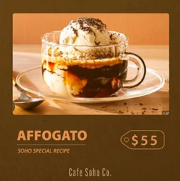
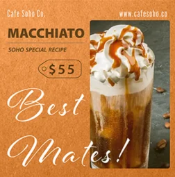
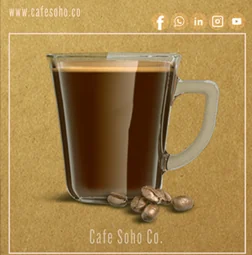
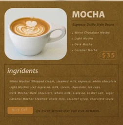
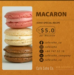
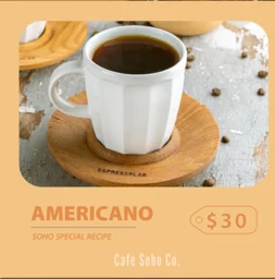
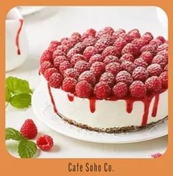
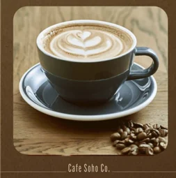
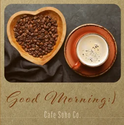
I built the kit to read like the cafe's display counter: first the product, then its name, then its price. The kraft paper texture and the rounded photo card repeat in every post, so the feed reads like a single menu.
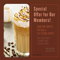
Kraft paper texture: orange, caramel, cherry and espresso.
A vertical card with rounded corners; the product is always the hero.
A bold product name, a thin rule and the “Soho Special Recipe” signature.
A punched price card borrowed from the cafe's own tags, with the Cafe Soho Co. signature below.
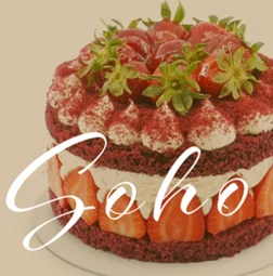
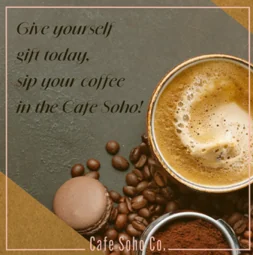
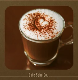
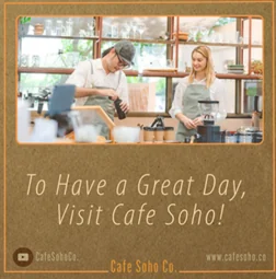
I sequenced the posts with an eye on how they would sit side by side in the profile grid. Light and dark squares alternate like a checkerboard, and atmosphere posts slip in between the product cards.
CS@cafesohoco
I sequenced the homepage like a visit to the cafe: welcome, story, coffees, desserts, menu, community. Latte and espresso half-screens swap places down the page, and the product grid reads like a menu board.
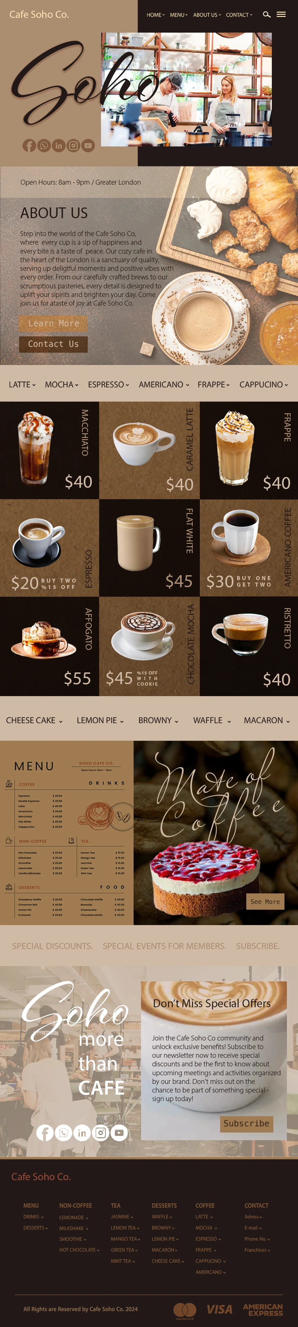
Scroll inside the window to browse the page from top to bottom.
The latte and espresso panels swap places from section to section, giving the page its rhythm.
Vertical product name, large price and promotion note sit in the same spot on every card.
The newsletter and membership call link up with the members-only promotions in the social kit.
Cafe Soho Co. / Case study
The website, the social media and the palette all speak for the same cafe; whichever door a guest walks through, they find the same cup.
A sample study for a London cafe: website UI design, social media kit and colour palette.
I studied this project as a sample study for cafes: Cafe Soho Co is a charming cafe nestled in the heart of London, renowned for its welcoming ambiance and delectable offerings. They pride themselves on being a sanctuary of quality, where every cup of coffee and every bite of food is infused with happiness and hope, creating delightful moments for their customers.
Seeking to enhance their online presence and engage with their audience in a more meaningful way, Cafe Soho Co approached me for my expertise in UI design and social media management. I provided them with a complete package, including a redesigned website, captivating social media posts, and a cohesive color palette and style that perfectly encapsulated the brand's identity.
Colour palette: - #CFBAA5 - #AB8D71 - #221816 - #150D09
Brand fonts: - Primary font: Myriad Pro Regular - Secondary font: Myriad Arabic Regular - Supporting font: Myriad Regular
Works: - Social media kit design - UI design for website