UAL Design / Branding and corporate identity
A colorful brand
for colorful mirrors.
A vibrant brand for an Etsy shop selling mirror frames, speaking to a young audience and stretching from the logo and color palette to the Etsy storefront and the Instagram feed.
Explore the project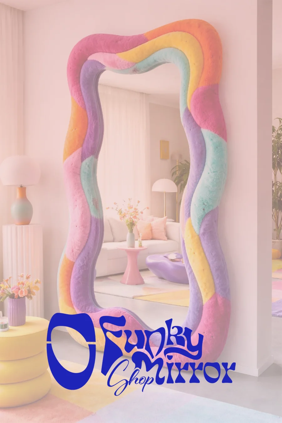
Not a mirror,
a mood.
Funky Mirrors Shop is more than a digital store that only sells mirror frames.
This is an Etsy shop project I built on my expertise in branding, brand creation and identity design. Throughout the branding process, I designed every detail, from the logo to the choice of color palette, to create a lively, energetic brand that appeals to a young audience.
Thanks to the care I put into getting things right, every detail and design blends seamlessly with the brand's identity. That consistency carries through into the design of the social media kit as well.
- Branding
- Brand creation
- Logo and identity design
- Color palette design
- Etsy shop setup
- Social media kit design
A funhouse
mirror.
The letters stretch and curve like a reflection in a funhouse mirror: Funky and Mirror ripple and lean into each other, and a handwritten Shop settles into the space between them. The icon on the left is a simplified version of the shop's product: a tall, slightly askew oval mirror.
Logo system
Icon and wordmark
Etsy storefront, banners, packaging. The brand's full signature wherever there is horizontal space.
Wordmark only
Product photos, T-shirts, notebook covers; places where the icon would feel repetitive.
FM Shop
F and M inside a mint mirror. Labels, stickers and small prints.

Mirror icon
Browser tab, profile picture, app icon. Still recognizable at small sizes.
Favicon
Funky Mirrors ShopNew tab
On backgrounds
Color palette
- #1E24B9Funk blueLogo, headings, outermost outline.
- #E614BFDisco pinkSecond outline, eye, accents.
- #76E1BFMintMirror shapes, monogram background.
- #E5FFC7Lemon creamShape fills, logo on dark backgrounds.
Typography
Eckmannpsych Small
The brand's default typeface and a reflection of the identity; used for short headings.
Ashemore Norm Bold
Complements the primary typeface and is used alongside it.
Futura PT Light
Pairs well with both typefaces and steps in as a fallback when needed.
Shape language and patterns
Wavy frames,
plenty of color.
The shop's products: wavy mirror frames with organic lines. From floor-standing full-length mirrors to wall mirrors; models painted in layers, colored piece by piece or finished in plush textures.
Glass that shines
in the feed.
I set up the Etsy shop and dressed the storefront in this identity. For Instagram, I also created a post kit that always puts the mirror at the center: a lemon background, pink bands spilling over the edges, a short note in the corner. The mirror photo changes, the frame stays the same.
Product visuals
Instagram posts
From the mirror
to the wardrobe.
To show that the identity works beyond the mirror, I tried the shape language on a T-shirt and notebooks. The eye and shapes pattern carries the brand on its own, on both the front and the back of an oversized T-shirt.
Notebook covers · patterns and secondary logo
Funky Mirrors Shop / Branding and corporate identity
One mirror, one family of shapes,
one shop.
What I did
- Brand
- 2024
- UAL Design
Disciplines
- Branding
- Brand Creation
- Logo & Identity Design
- Colour Palette Design
- Etsy Shop Creation
- Social Media Kit Design
Brand creation from scratch for an Etsy shop of mirror frames: mood board, colours, typography, logo system and social media kit.
Funky Mirrors Shop is more than just a collection of mirror frames; it's a testament to my proficiency and skill in branding, brand creation, and identity design. As the designer and owner of this Etsy shop project, I've leveraged my expertise to create a unique and captivating identity that sets Funky Mirrors Shop apart from the rest.
From the logo design to the color palette selection, every aspect of Funky Mirrors Shop's brand creation has been carefully curated to reflect its vibrant and lively energy. My commitment to excellence is evident in the social media kit design, which seamlessly integrates with the brand's identity, creating a cohesive and engaging online presence.
In adding Funky Mirrors Shop to my digital creative agency portfolio, I aim to showcase my ability to create brands that resonate with audiences and stand out in a crowded market. With a focus on creativity and innovation, I'm confident that Funky Mirrors Shop will capture the attention of potential customers and inspire them to explore the world of unique mirror frames.
Brand Creation
1. Mood board Why do I prepare a mood board before creating the logo, colours, typography and the social media kit?
To see the combination of the elements that I have created or chosen: Creating a mood board allows you to visualize how different design elements such as colors, fonts, and imagery work together. It helps you ensure that the elements complement each other and convey the desired message or aesthetic.
To show my customer the aesthetic created: Presenting a mood board to your customer helps them understand the visual direction of the design. It allows them to see the overall aesthetic and style you are proposing for their social media kit, which can facilitate communication and alignment of expectations.
To determine the direction of the design style: A mood board serves as a roadmap for the design process by establishing the visual direction and style. It helps you stay focused on a cohesive design concept and ensures that all design elements are consistent and aligned with the desired style.
2. Brand colours Brand statement: "FUNKY MIRROR SHOP, where creativity meets reflection. Our unique, quirky mirror frames are not just pieces of decor; they are statements of individuality. Designed for those who dare to be different, our colorful mirrors add a touch of spice to your space, ensuring every reflection is as vibrant and unique as you are. Embrace creativity, celebrate individuality, and let FUNKY MIRROR SHOP be the mirror to your distinct personality."
Brand values: - Creativity and Innovation: FUNKY MIRROR SHOP is committed to pushing the boundaries of conventional design, constantly bringing innovative and creative mirror frames to the market. - Individuality: The brand values and celebrates the uniqueness of each customer, providing them with mirror frames that stand out and mirror their distinct personality. - Quality Craftsmanship: FUNKY MIRROR SHOP prioritizes high-quality materials and meticulous craftsmanship to ensure durable and visually stunning mirror frames. - Joy and Positivity: The brand believes in spreading joy and positivity through its colorful mirror frames, aiming to keep customers smiling every time they look into their mirrors.
Colour palette and meaning of brand colours: - #1E24B9: Dark blue. Meaning: trustworthiness, reliability, and professionalism. Strategy: dark blue symbolizes the brand's commitment to quality craftsmanship and innovation. It communicates a sense of stability and confidence in the brand's products and services. - #E614BF: Pink. Meaning: playfulness, youthfulness, and creativity. Strategy: pink represents the joyful and positive aspect of the brand. It communicates the celebration of individuality and adds a playful touch to the brand's identity. - #76E1BF: Water green. Meaning: harmony, balance, and growth. Strategy: water green reflects the brand's focus on sustainability and environmental consciousness. It communicates a sense of harmony with nature and growth in creativity and innovation. - #221816: Dark brown (neutral base colour). - Lemonic green. Meaning: freshness, vitality, and rejuvenation. Strategy: lemonic green symbolizes the brand's vibrant and energetic personality. It communicates a sense of freshness and vitality, encouraging customers to feel energized and inspired by the brand's products.
3. Brand typography Typography is the key: Selecting the appropriate typography for your brand is paramount as it establishes the tone of your communication. The fonts chosen are meticulously paired to harmonize with each other and resonate with your brand's essence. Employing a diverse range of fonts prevents design monotony and fosters visual interest.
Strategic font selection: Your brand's fonts are meticulously curated to complement one another and reflect your brand identity. By offering a variety of font sets, your design maintains its freshness and avoids becoming predictable. Consistent use of typography throughout your brand ensures that you are easily recognizable and leaves a lasting impression on your audience.
Power of consistency: Utilizing cohesive typography across all brand materials is instrumental in establishing your brand's identity and enhancing memorability. Each font is thoughtfully chosen to seamlessly blend with your brand's ethos, creating a harmonious visual language. Consistency in typography not only fosters recognition but also reinforces brand recall among your audience.
4. Logo design Primary logo: The primary logo is the main voice of the brand. This should be used most frequently when space allows for it. The primary logo can be symbolized as the trunk of the tree and the other logo marks and variations as the branches. The primary logo sits nicely with the brand pattern and can be used with just one color, too.
Logo variation (secondary logo): A logo variation is essentially an alternative presentation of your primary logo, rearranged to fit different formats, and is sometimes known as a secondary logo. For instance, if your primary logo is designed in a horizontal layout, there may be instances where space limitations prevent you from using it in its exact dimensions. Rather than resizing your logo, your designer should provide you with alternative layouts to accommodate various needs, ensuring that your logo remains legible at all times. Another important variation your designer should offer is a one-color logo option. For example, if your primary logo features multiple colors, your designer should also provide you with a one-color version, typically in black, for situations where full-color printing is not feasible.
Logo mark: Logo marks are a simplified version of the main logo. This sometimes consists of two letters or a symbol that fits in with your brand. Having something simpler works well when you have a more confined space to fill. The logo mark can be used in any of your brand colours, and also makes a beautiful repeated pattern.
Logo submark: Your logo submark is the sleeker, more versatile sibling of your primary logo, designed for subtlety and flexibility. It's like a sophisticated watermark, perfect for situations where your main logo might be too overpowering. Use it on secondary printed materials, social media profiles, website footers, favicons, and the reverse side of business cards. Many photographers use their logo submark as a watermark on photo proofs, while some businesses create unique submarks for each service, maintaining a cohesive yet nuanced brand identity. Incorporating a logo submark into your designs adds a playful, professional touch to your branding strategy.
Logo elements: Logo elements can encompass patterns, textures, icons, or other visual components that unify your brand and enhance its recognizability. For instance, in my example, the elements consist of the extracted geometric shapes which represent mirror frames. Typically, these elements do not include words or brand names; they are usually standalone icons, designs, or patterns that can be used consistently across all branding materials. These elements should complement your branding and should be used alongside your main logo or its variations.
I hope this explanation clarifies why there are multiple logo options and when each should be used. Each individual logo and element work together to create a cohesive and recognizable brand identity, allowing you to incorporate multiple logos into your branding in a versatile manner. If you are considering a rebrand or starting the logo design process, ensure your designer will create a comprehensive branding package for you, as demonstrated here, where all elements work together to establish your brand identity.
5. Social media kit design