Primary and secondary logo
A badge that gathers foam, a pressure washer gun and a polishing machine inside a single red ring; beside it, a secondary logo made of lettering.
Go to the logoUAL Design / Logo and corporate identity
A corporate identity for AS Detailing, specialists in car washing and modification, reaching from the primary logo all the way to the vehicle form and speaking in black, red and silver.
Explore the project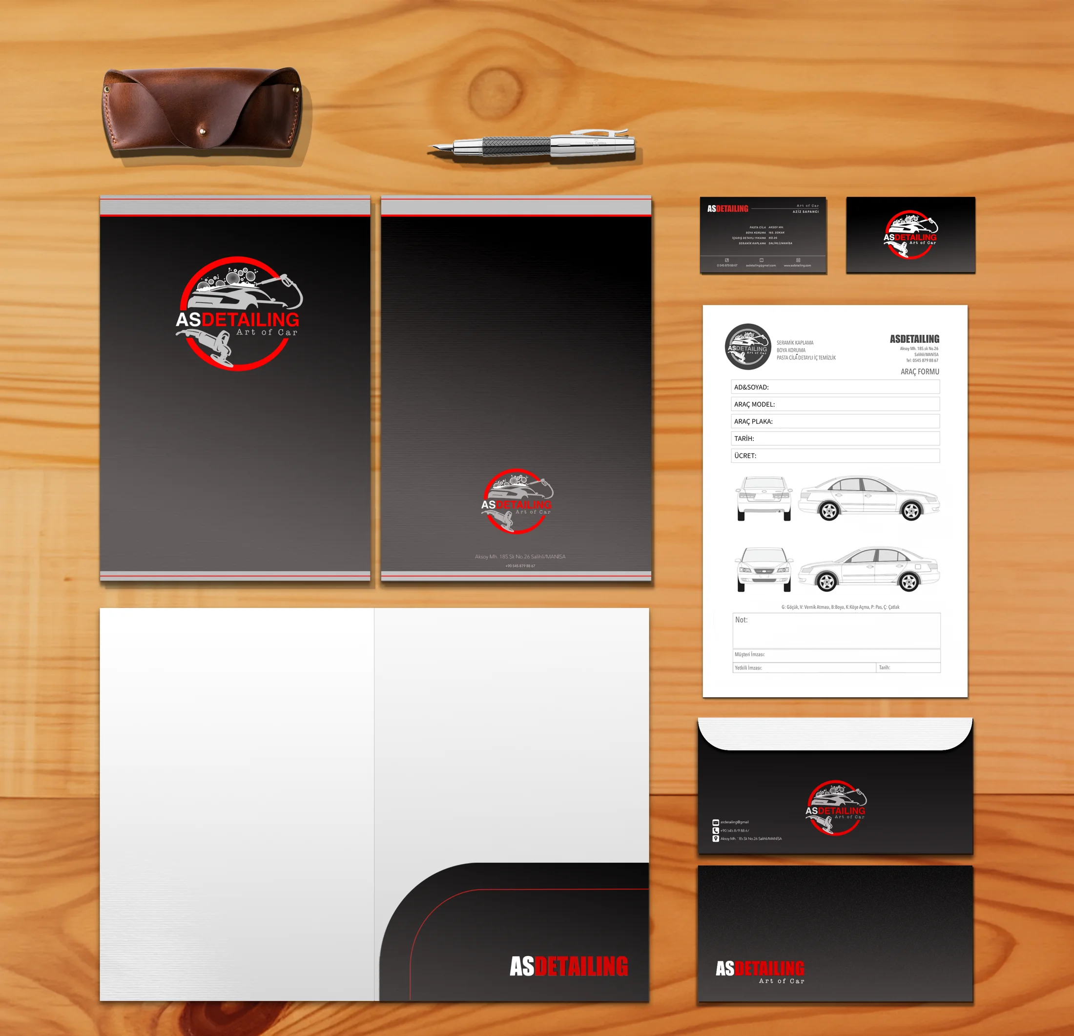
AS Detailing is a business specializing in car washing and modification.
They reached out to me to create their logo and corporate identity. For the company I designed an original primary logo, a secondary logo, a corporate color palette and a typography system, along with a business card, a vehicle form, a corporate envelope and a folder.
The shared goal of these designs was to highlight AS Detailing's dynamic, innovative character and to bring the company's strong, professional standing in the industry to the fore.
A badge that gathers foam, a pressure washer gun and a polishing machine inside a single red ring; beside it, a secondary logo made of lettering.
Go to the logoBlack, red, silver and white; three typefaces, each with its own job to do.
Go to the palettePrinted materials that make every sheet of paper the customer holds part of the same workshop.
Go to the materialsI built the primary logo around the journey a car takes through the workshop. The foam stands for washing, the gun reaching in from the right for detailed cleaning, and the polishing machine entering the ring from below for compound polishing. The sports car in the middle is where it all leads.
The red ring breaks in two places: the gun's hose and the polishing machine spill outside it. That overflow gives the logo the feel of a workshop in motion rather than a static seal.
Interior and exterior detailing
Pressure cleaning, speed
Compound polish, ceramic coating
Protection; paint protection
On the sign, the folder cover, the front of the business card and the envelope. The brand's signature.
For horizontal spaces where the badge does not fit: the back of the business card, the front of the envelope, the pocket folder.
A handcrafted accent that sits under the secondary logo and above the name line on the business card.
I took the palette from the workshop itself: the black of tires and asphalt, the red of a brake light, the silver of rims and chrome. Black carries the background, red the brand name, silver the tools and the car; white shines only in the AS letters and the foam.
Gradient on printed surfacesA soft gradient from black to graphite on the business card, envelope and folder covers, as if light were falling from above
The wide, sturdy brand name inside the badge.
Narrow and tall; for horizontal spaces, headings and the form title.
With generous letter spacing, a nod to the workshop's craftsmanship.
The samples on this page are shown in the open web fonts closest to the brand's typefaces; the original fonts were used in the designs.
I built every printed surface on a single rule: a gradient background fading from black to graphite, the badge or the condensed lettering on top, and a single red line along the edge. Whether the customer slips the business card into a pocket or opens the folder, they are inside the same workshop.
Services printed on the card: Compound polish · Paint protection · Interior & exterior detailing · Ceramic coating
Aksoy Mh. · 185. Sokak · No. 26 · Salihli / Manisa
Services and address line up row by row, so the card reads from left to right like a workshop ticket.
The vehicle form is the hardest-working piece of this identity. It is filled in the moment a car enters the workshop and signed together with the customer. That is why I left the black background out here: white paper, a gray badge and nothing but ink. It is quick to write on, cheap to print and holds up on a photocopier.
Single-letter codes, so they can be jotted quickly on the drawing and read the same way by everyone.
I took the badge off the paper and carried it onto the workshop's facade, the side of the service van and the wall inside. This is where the circular form earns its keep: on a hanging sign or on a van door, it stays uncropped, keeps the same proportions and reads from a distance.
The anthracite background softens the badge's black in daylight; the red ring stands out from the street.
The van's own black becomes the background; with no separate panel needed, the badge sits directly on the bodywork.
The wall sign is lit by two spotlights; customers come face to face with the brand as they hand over their car.
AS Detailing Co. / Logo and corporate identity
From the business card to the service van, every surface speaks for the same workshop; whichever door customers hand their car over at, they see the same care.
Primary logo, secondary logo, colour palette, typography and corporate stationery design for a car wash and modification company.
AS Detailing Company specializes in car wash and modification services. When they contacted me to create their corporate identity, they emphasized their meticulous interior and exterior car wash, polishing, and ceramic coating services, which they carry out with extraordinary attention to detail. In line with their request, I decided to create designs that best reflect the company's vision and values.
In this context, I created an original main logo, secondary logo, corporate color palette, and typography, as well as an impressive business card design, vehicle form design, corporate envelope design, and file design. With designs that highlight AS Detailing's dynamic and innovative structure, I aimed to emphasize the company's strong and professional identity in the industry.
Colour palette: - #FFFFFF - #FD0000 - #C5C5C5 - #000000
Brand fonts: - Primary logo: Noto Sans Oriya Bold - Secondary logo: Router Medium Italic & Bold - Supportive logo: American Typewriter Regular - Body: Noto Sans Oriya Regular